Expert Consultants
5,000+ Projects Delivered
Trusted Across Australia
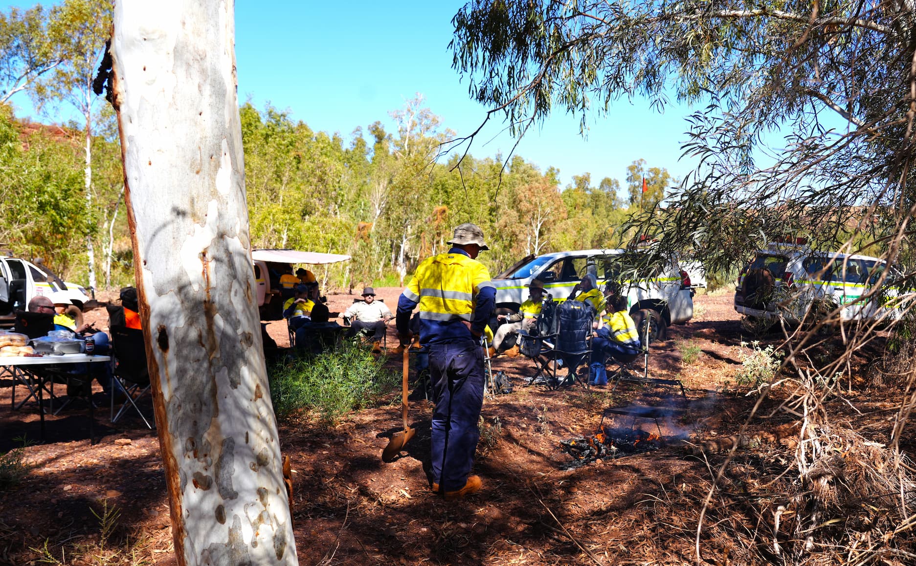
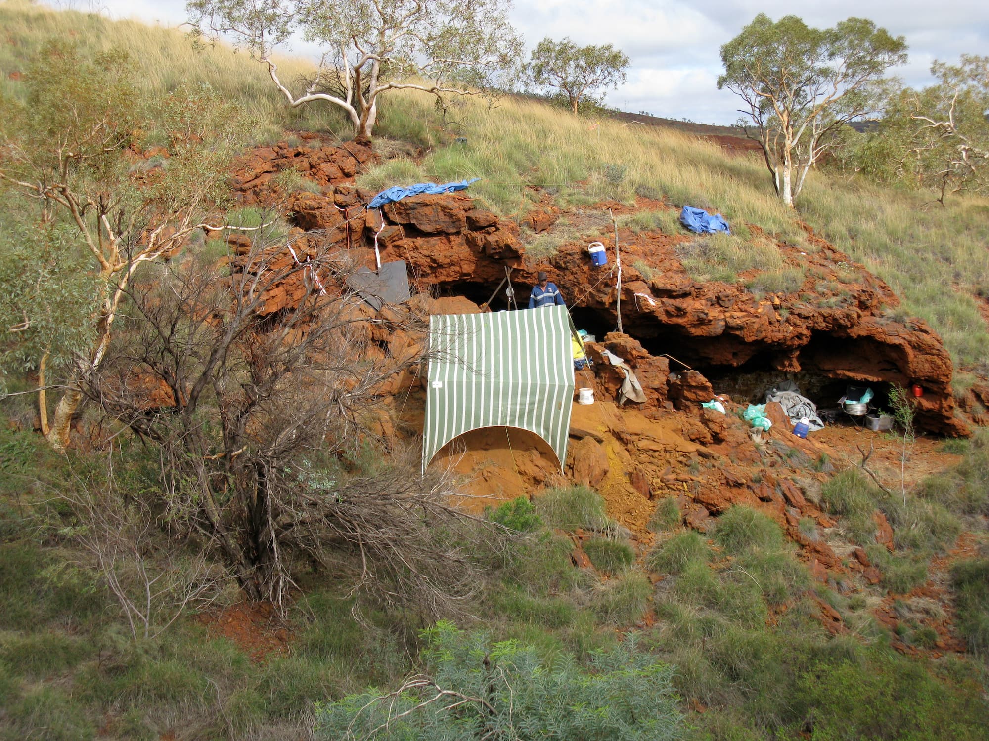
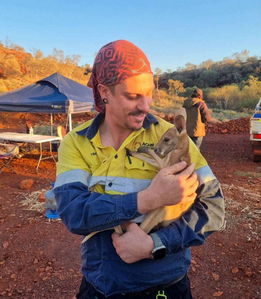
ACHM is a leading national cultural heritage management consultancy, delivering Aboriginal heritage assessments, archaeological services, Cultural Heritage Management Plans, and statutory approvals to manage heritage risk for infrastructure, resources, renewables, and development projects
For over 25 years, ACHM has been a trusted partner in navigating the complexities of cultural heritage projects nationwide. We provide our clients with confidence, clarity, and care, ensuring projects are completed on-time and on-budget, while always respecting relationships and cultural values.
How we support your project
ACHM delivers a comprehensive suite of services designed to support our clients in managing cultural heritage requirements with confidence and clarity.
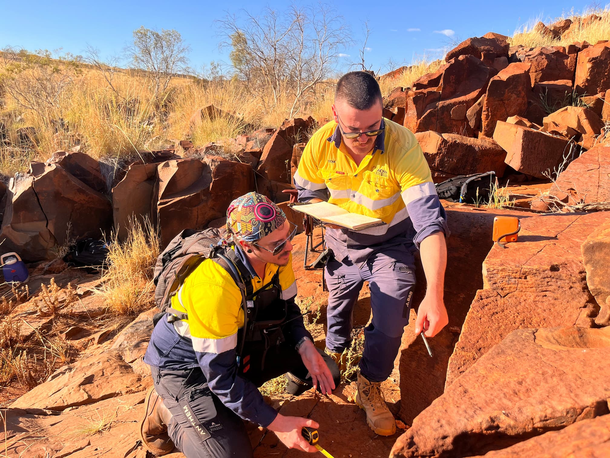
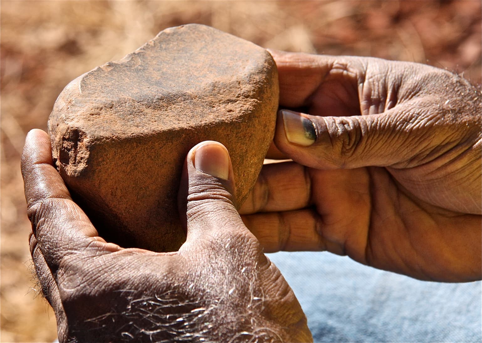
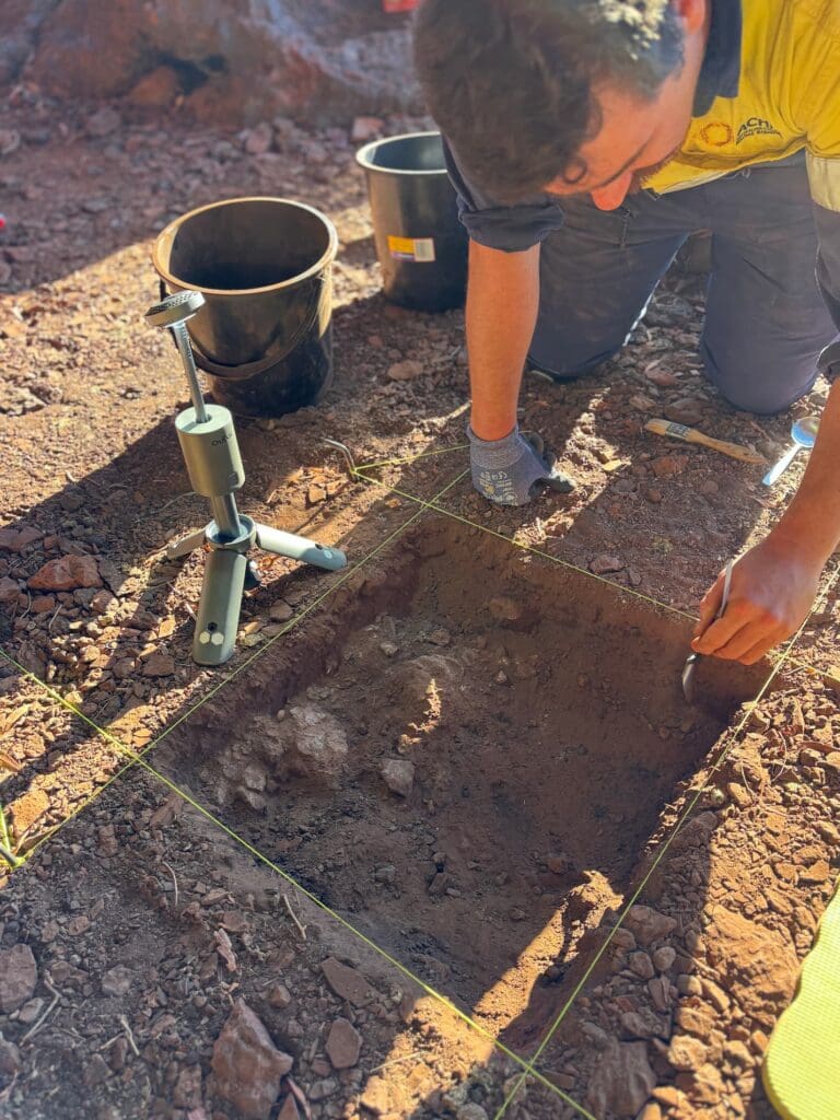
Archaeological Assessments
Cultural Heritage Management Plans
Archaeological Site Monitoring
Cultural Values Assessments
Due Diligence Assessment
GIS and Mapping
Let’s Get Your Project Started
Setting the Standard in Cultural Heritage
5,000+ Projects Delivered
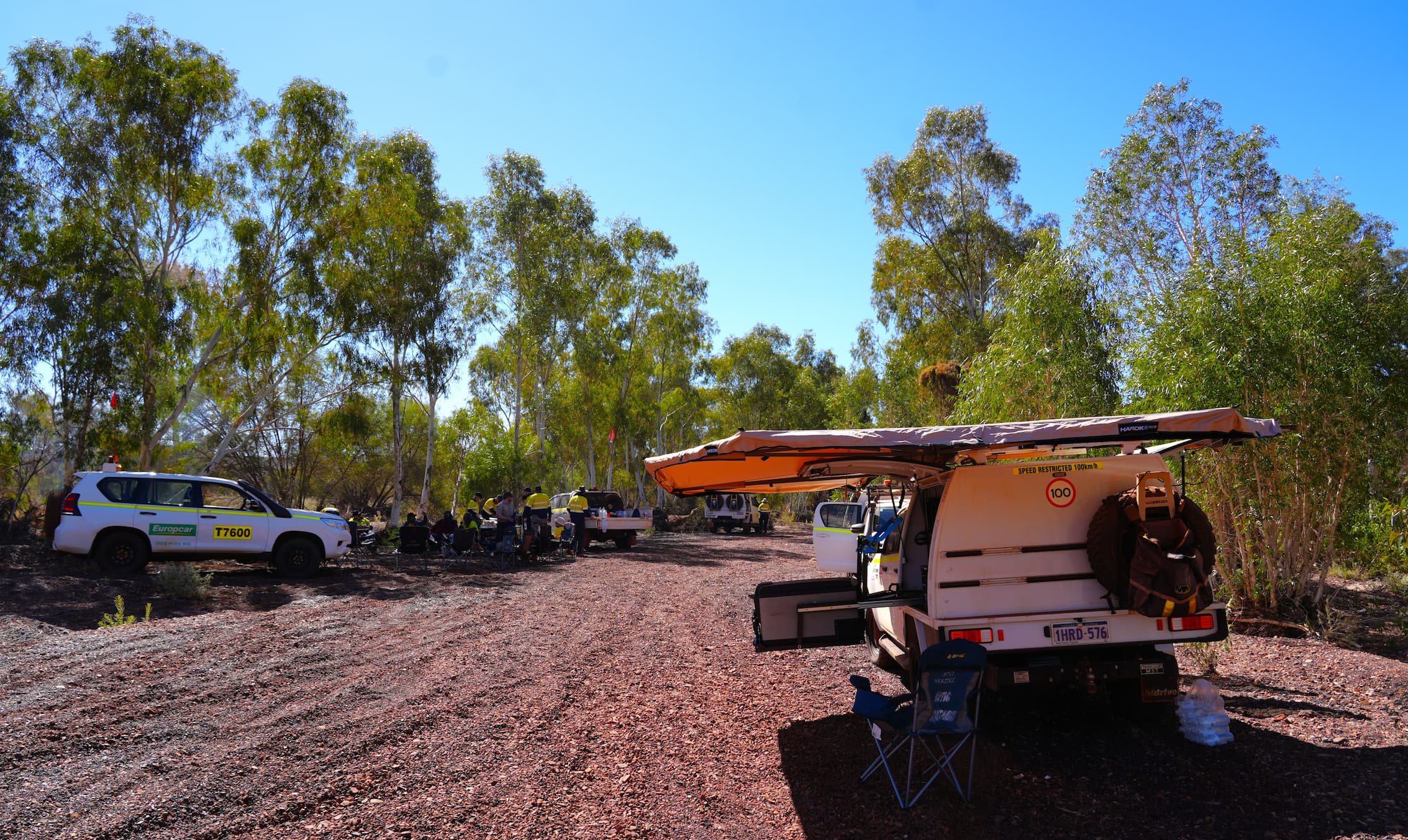
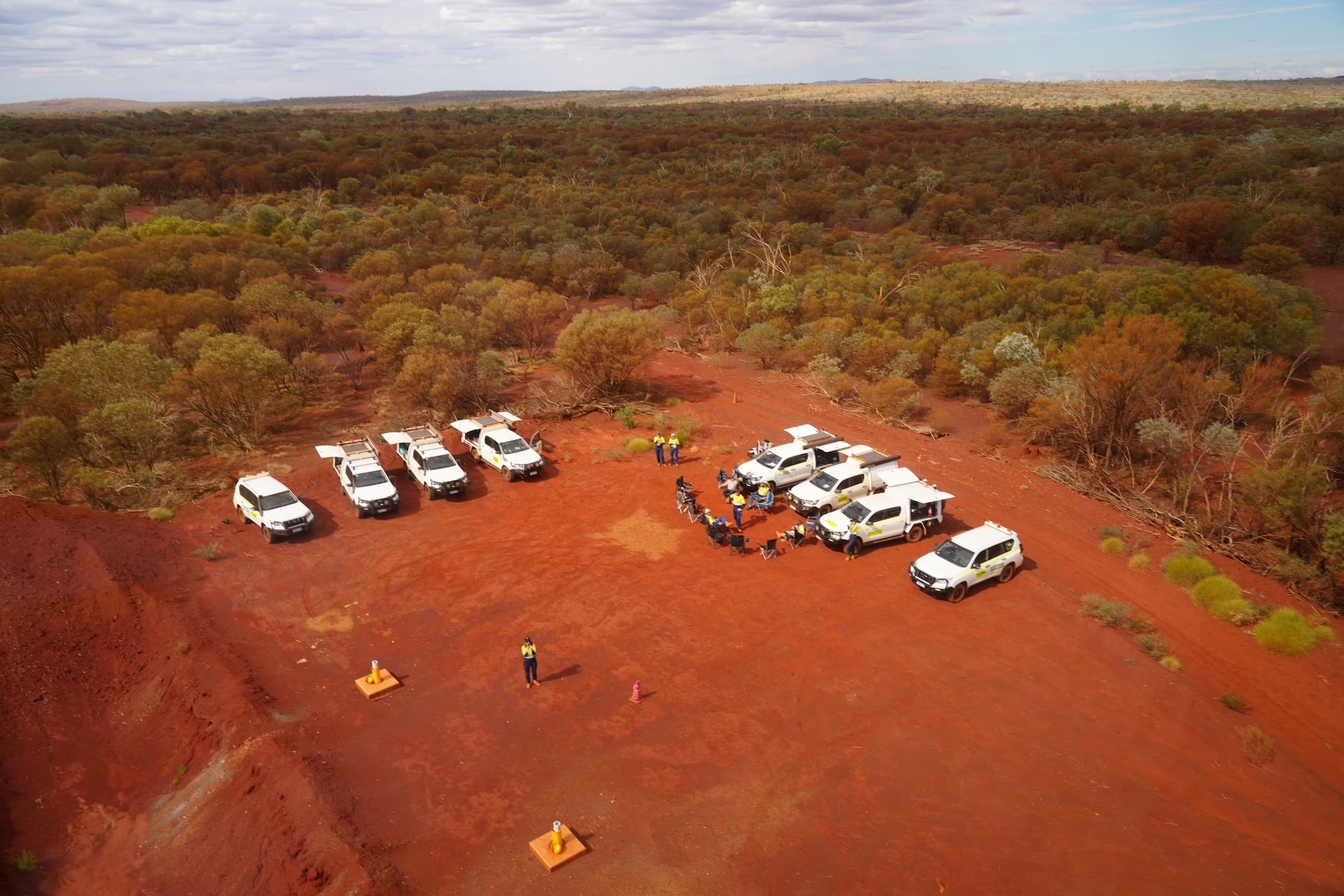
With expertise across energy, transport, mining, infrastructure, renewables, government, and urban development sectors, we bring unparalleled experience to every project.
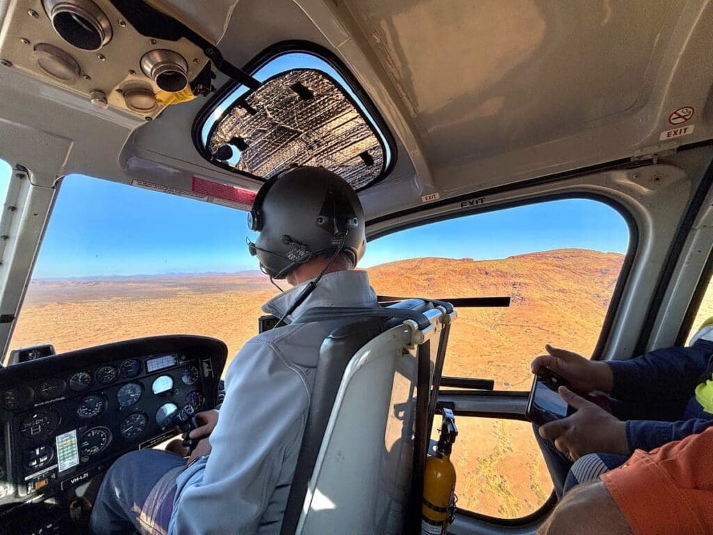
Nationwide Reach, Local Insight
Our team of experts spans Australia, combining national expertise with deep local knowledge and well-established relationships with Traditional Owner groups.
Certified & Compliant
Our safety, quality, and environmental systems are certified to ISO 9001, ISO 14001, and ISO 45001 standards.
The Values That Guide Our Work
Collaboration
By working closely with clients, Traditional Owners, and stakeholders, we deliver outcomes that reflect shared goals and mutual respect.
Respect
We acknowledge the deep histories, cultures, and traditions of First Nations peoples, ensuring that every project reflects a commitment to preserving and celebrating cultural heritage.
Empathy
Understanding diverse perspectives is at the heart of our work. We listen deeply, act with cultural sensitivity, and approach every project with integrity and care.
Accountability
We take full responsibility for our work, our impact, and our commitments, ensuring that we always act with professionalism and responsibility.
Transparency
Open and honest communication is key to building trust. We prioritise clarity and ethical practices in every interaction.
Excellence
We set the benchmark for cultural heritage consultancy, delivering innovative, precise, and high-quality solutions that exceed expectations.
Testimonials
Mandy Edwards
Sector Manager | Millar Merrigan
ACHM has consistently provided us with expert advice on Aboriginal cultural heritage matters, including the preparation of Cultural Heritage Management Plans. They’re great to work with—professional, competitively priced, and reliable in meeting timeframes. Their practical approach and responsiveness make them a valued partner on our projects.
Ed Armstrong
Chief Executive Officer | Banjima Native Title Aboriginal Corporation
ACHM are engaged extensively across Banjima Country and they provide exceptional expertise, professionalism, customer service and a genuine passion for preserving and promoting cultural heritage. ACHM goes beyond mere consultancy through consistently delivering professional services, solutions and best practice in every thing they do.
Jordan Bell
Senior Development Manager | Dav Consulting
We recently engaged ACHM to manage extensive Cultural Heritage Artefact Salvage Operations for an expansive and complex greenfields development site on north side of Melbourne. The diligence, open communication, efficiency and positive outcomes achieved by the ACHM Team, including in their coordination and management of the local RAP, was first class, and made my job as Development Manager substantially easier. Cannot recommend highly enough
Chris Monahan
Senior Development Manager | Avid
I have been a client of ACHM for over a decade and have engaged their services across four large-scale projects. Throughout this time, their dedication and professionalism have remained consistently impressive. ACHM excels at managing client expectations while operating sensitively within complex environments. They are highly skilled at guiding clients through cultural heritage approval processes, striking the delicate balance between client priorities and cultural sensitivities. I highly recommend ACHM for their expertise and commitment.
Fionna Warren and Chanz Crowley
ABIGroup
We wish to thank yourself, Erica Walther and Shaun Canning who have at all times been professional, free to discuss potential options and provide feedback on the status of the Cultural Heritage Management Plans. We have found the ACHM team to be knowledgeable and very easy to deal with.
Dylan McWhinney
Environmental Coordinator, GMW Connections Project
ACHM have provided us with numerous due diligence assessments and Cultural Heritage Management Plans to both standard and complex level. They approach their scope with our project timeframes and budgets in mind, and I know I can rely on them to get the best outcome for these projects. ACHM provide pragmatic staff with great traditional owner relationships allowing for quick turnaround times.
Remove project risk with dedicated support
Explore Our Services

Meet our Team
View Our Projects
See how we’ve helped clients across Australia achieve meaningful outcomes while honouring cultural heritage.
Need Expert Cultural Heritage Support for Your Project?
ACHM is here to help. Call us today on 1300 724 913 or email us for more information.